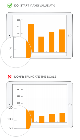
Show your data at the right scale.
Improper scale can make major insights seem mediocre and minor deviations feel massive.
To correctly represent the story your data is showing:
• Make sure the scale of your axes accurately reflects the size of the data you’re visualizing
• Choose the axes that will best represent trends in your data. Will absolute numbers or percentages make
your data clearer?
• Don’t use cropped axes. Always start the Y-axis at 0

If you wish to improve the design of your Qlik applications contact us to know more about our training & consultancy expertises !
Laetitia Larchanche


