Introduction :
In February 2023, Qlik released a series of updates for its Qlik Sense and Qlik Cloud platforms. These updates bring new features and improvements, offering users and developers even more control over the customization and management of their dashboards. So, a little late, we’ll tell you all about these new features!
What’s new in Qlik Sense – (Users/Developers):
1. Customization of font ❤️
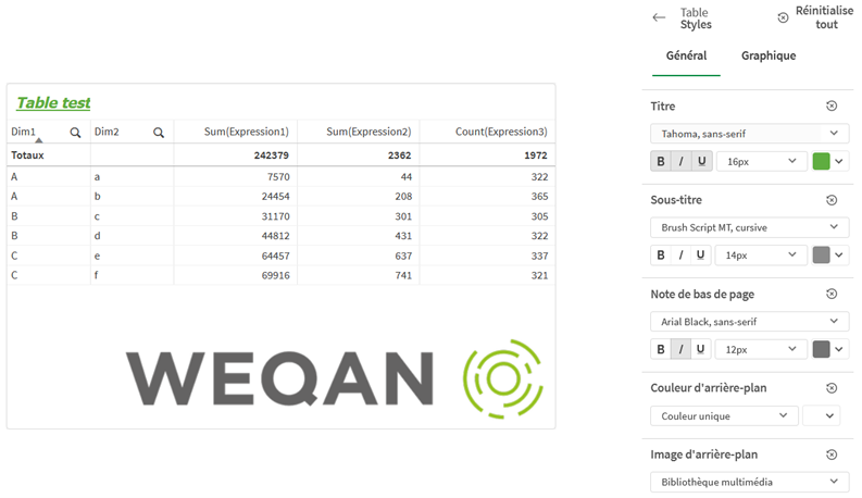
It is now possible to customize the font used for titles, subtitles, and footnotes in their visualizations using a new general tab that offers options to change font type, size, and color.
This may seem basic, but it is actually a real revolution in Qlik Sense.
These features were present in Qlikview and also in Power BI: they are finally available in Qlik Sense on-premise! Our retail clients will be very happy with this news.
Everything is customizable: Pivot tables, simple tables, box plots, combined charts, distribution charts, gauges, histograms, key performance indicators, waterfall charts…
2. Control of the number of bubbles
You can now control the number of bubbles displayed in the scatter charts you create. These charts can display up to 50,000 data points, but if more than 5,000 bubbles are visible, bubble labels and those that are out of bounds are not displayed.
3. Another highlight ❤️of this review:
Sheets can now have custom background images and colors, allowing you to divide your sheet into sections, add images from your multimedia library, etc. You can set a background color using the color picker or by expression.More control!
4. Control
- More control over the placement of objects and the size of the sheet grid to support advanced presentation formatting.

- Control of graphical transitions. Gradual transitions in a visualization from the old view to the new view when data has been modified, for example, after a selection. Animations can be enabled or disabled in the application settings, in unpublished applications.
5. ServiceNow ODBC connector
You can now access data stored in ServiceNow.
New features in Qlik Sense (Administrators):
1. ⚠️Version 9.6 of PostgreSQL will no longer be supported.
It is important to note that version 9.6 of PostgreSQL will no longer be supported. To continue to receive full support, it is recommended to use the Qlik PostgreSQL installer to upgrade their database. We suggest that customers schedule an appointment with us for upgrading their PostgreSQL version to ensure optimal platform performance.
2. During a silent installation, configuration files will no longer be overwritten.
New features in Qlik Cloud:
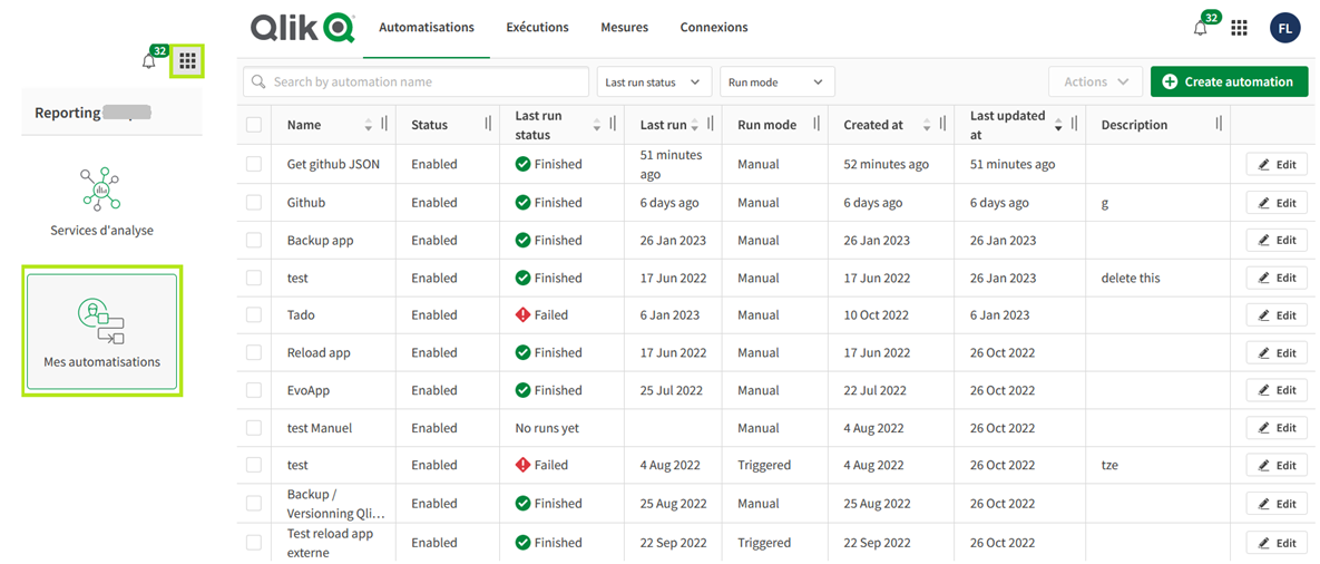
1. Centralized page
Addition of a centralized page for monitoring automations: we love it! ❤️
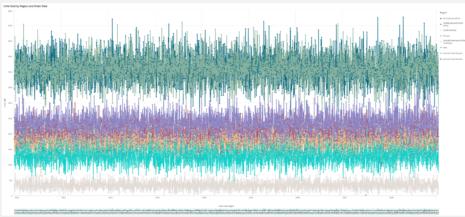
2. Control of visible number of points and lines
You can now control the number of visible points and lines displayed in line charts, with a maximum of 50,000 points and 1,000 lines for continuous dimension axes.
3. Font customization like in Qlik Sense
Customize the font used for titles, subtitles, and footnotes in tables, scatter plots, and text/image objects.
4. Background color/image customization ❤️
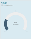
So many favorites in this review! The background color or custom image in simple tables, pivot charts, pie charts, and bar charts can be customized.
5. Qlik business Glossery ❤️
Qlik business Glossary allows you to know directly what a measure or indicator corresponds to without having to go back to a user guide. https://www.youtube.com/watch?v=DPdFJ8kxK3I
6. 5 new alerts for reload events:
-
- Fail: an engine connection error prevents reload.
- Fail: a session retrieval issue results in reload failure.
- Fail: “Engine openDoc” leads to reload failure.
- Fail: reload fails due to authorization issues.
- Exceeded_limit: monthly reload limit has been exceeded
7. Amazon Redshift
You can now use Amazon Redshift as a cloud data platform in Qlik Cloud Data Integration.
8. Qlik Data Gateway – Direct Access 1.2.0
It now supports SAP SQL and SAP BW connectors, providing encrypted connection to Qlik Cloud.
9. Qlik and SharePoint:
Save a simple multi-page PowerPoint report to Microsoft SharePoint.
This template will generate an app-based report, including all public sheets without any applied selections. Each generated report will then be saved as a PowerPoint file in Microsoft SharePoint.
10. QlikAutoML Tutorial Update:
Conclusion :
As you may have gathered, these new features do not leave us indifferent, and we have had many favorites!
And you, which ones do you like the most?
Here are some useful links to complement this article:
Bug resolution: https://community.qlik.com/t5/Release-Notes/tkb-p/ReleaseNotes/label-name/saas?labels=saas Qlik Sense SaaS in 60’: Mini format with currently 67 videos of 60 seconds on different Qlik Sense SaaS features: https://www.youtube.com/playlist?list=PLW1uf5CQ_gSq6klZOXSpKQ0afQFJyqqEh
Follow our news:
How to share my Qlik Sense® application on Microsoft Teams?
WeQan news: December 2022 Qlik Sense on-premise Release note November 2022
See you soon!


