
The Qlik World Congress, organized online this year, took place in early May 2021. We took the time to browse through the important topics and new features offered by Qlik to come and talk to you about them. One of the topics that we find every year is about the best visuals on Qlik Sense.
It’s also a topic covered regularly in Qlik Techspert Thursdays and new releases. You can review the session by logging into Qlik.com with your credentials and going to the Qlik World session or also access the Techspert Thursday session which does not require authentication.
In this article, we have chosen to present to you two new tips and a new graphic among some thirty new features made available for 2021.
- Time plan chart avec trellis et tables
- Comparaisons avec l’année précédente
- Max et min labels
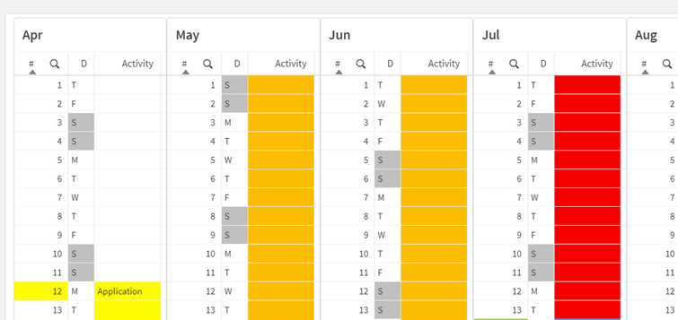
Plan your tasks with the Time plan chart with lattices and tables
The Time line chart can become an invaluable aid for any task planning. To do this, this graphic uses lattices and tables as well as the cell coloring function as objects. The trellis container will allow you to reproduce the object as many times as there are values in the dimension. You can find this in custom sheet objects within the Qlik Visualization Bundle. (Extension by Riley MacDonald)
Conveniently, you should use a calendar field as a dimension in your graph, such as the month for example. You will then also need to create an auto-calendar using the dual function which will allow you to combine a number and a text string in the same field value.
Example 1:
You will then be able to view the days, activities and weeks with different color codes to see the progress of your team’s activities.
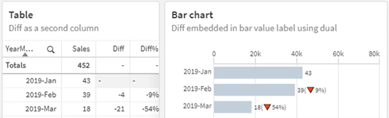
Comparison of the current year with the previous year
To give the visualizations more context, you may find it helpful to compare the current year to the previous year. This allows the emphasis to be on percentage growth or decline.
To do this, you can create a table and / or a graph showing the difference between your two selected years.
If you opt for the graph, this trick will allow you to visualize two values within the same label. Do not hesitate to use the dual function which will allow you to visualize the ratio within the value labels of your graph. To add strength to your visualization, uni code symbols can also be used in labels. Once in the sheet edition, write the formula of the symbol in the expression of the measure or add it in the “Icon” field of the measure.
Example 2:
You will be able to compare your sales, in quantity or currency, from month to month. The variation can be put in a table but also in the label of the value of your chart. Here the percentage shows each time the variation with the previous bar.
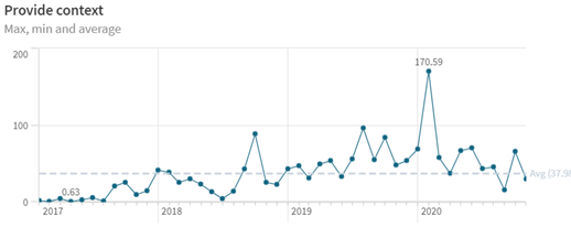
Show the maximum and minimum value directly in “labels”
Depending on what you want to show in your application and the purpose of your object, you can now choose to display only certain values of your graph such as the max or the min.
Until now, you could choose to display all of the x-axis values or none. Using the “dual” and “pick” functions in the measure expression, you can choose to display only one or two values.
Example 3:
dual(pick(match(Sum(Sales),
max(total aggr(sum(Sales),[OrderDate.autoCalendar.YearMonth])),
min(total aggr(if(len(minstring(Sales))>0,sum(Sales)),[OrderDate.autoCalendar.YearMonth]))
)+1,”,round(Sum(Sales)/1000,0.01),round(Sum(Sales)/1000,0.01)),sum(Sales)/1000)
Useful links :
Vidéo de 30 minutes : Top 10 Visualization Tips
Ou latest news :
- Collaboration Vizlib
- Vérifiez et améliorez vos performances Qlik Sense
- Encryption des données
- Release note de février
laetitia.larchanche@weqan.be
+32(0)489/970.736
Laetitia, Sales & Marketing manager