Each month, Power Bi is updated in a continuous improvement process. These updates add new content that improves your integration or analysis capabilities, but they also correct bugs or security holes.
In this article, we summarize the top features of the last 3 months. We also detail our opinion on the additions and give you our favorites (💖).
Reporting |
|
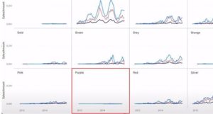
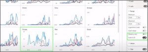
From now on, we can dissociate the y-axis and make it independent at each small multiple. This allows to have a more intelligible scale of values, as below for the same data set:
|
|
|
|
Modeling |
– INDEX will allow us to compare values to a baseline, – OFFSET will allow us to compare values to a previous value, – WINDOW will allow us to add a cumulative total, a rolling average or other calculations that essentially rely on the selection of a data range, – PARTITIONBY & ORDERBY are helper functions to the previous 3 that can only be used inside another function. Therefore, they do not return any value. These three functions are similar to the windowing functions in SQL. |
|
Services |
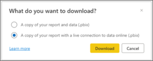
You have the choice of downloading your report with all the data included. Or you can download the report with an online connection to the data. In some cases, it was impossible to download the report, because it exceeded 1GB or because the dataset had been modified using the XMLA endpoint for example. |
|
Data Connectivity |
– Anaplan (Connector update) |
|
Over the past three months, the Power BI team has implemented some key features into the Reporting work. Developers will appreciate the contributions in graphical customization, and the ability to desynchronize the Y-axis on multiple graphs, allowing for a more consistent visualization.
In terms of modeling, developers will benefit from the new DAX features, which provide flexibility in processing and comparing data. The new “Optimize” section of the ribbon offers a very useful addition. When editing data on a sheet with many graphical elements, each change causes a reload that can freeze your application. With the waiting state and a button that refreshes the graphs on demand, the problem is solved.
Each month, multiple connectors are added to simplify data integration for all users of the services concerned. During the last quarter, for example, the BigQuery connector has been added and gives the possibility to import data from the Google Data Warehouse.
All the new features in Power BI can be found on their official blog. They also post a complete summary on Youtube every month in which they go into detail on all the points.
For more information, see our other BI article:
- The different Microsoft Power BI licenses
- How does BI support the retail sector through key indicators?
- Human Resources Analytics
laetitia.larchanche@weqan.be
+32(0)489/970.736
Laetitia, Sales & Marketing manager

